HET CONCERT
GEBOUW
graphic
refresh
clients:
The Royal Concert Hall, Amsterdam
The Royal Concert Hall, Amsterdam
role:
#identitydesign
CIRCUS Brand Architects
Amsterdam
#identitydesign
CIRCUS Brand Architects
Amsterdam


The grand dame of Amsterdam requested a little nip & tuck. So she would be more flexible and appear lighter on her feet.
Het Concertgebouw is always in pursuit of broadening their audience. The old identity was getting in the way. The frame was heavy and the amount of rules where stiffling creativity.
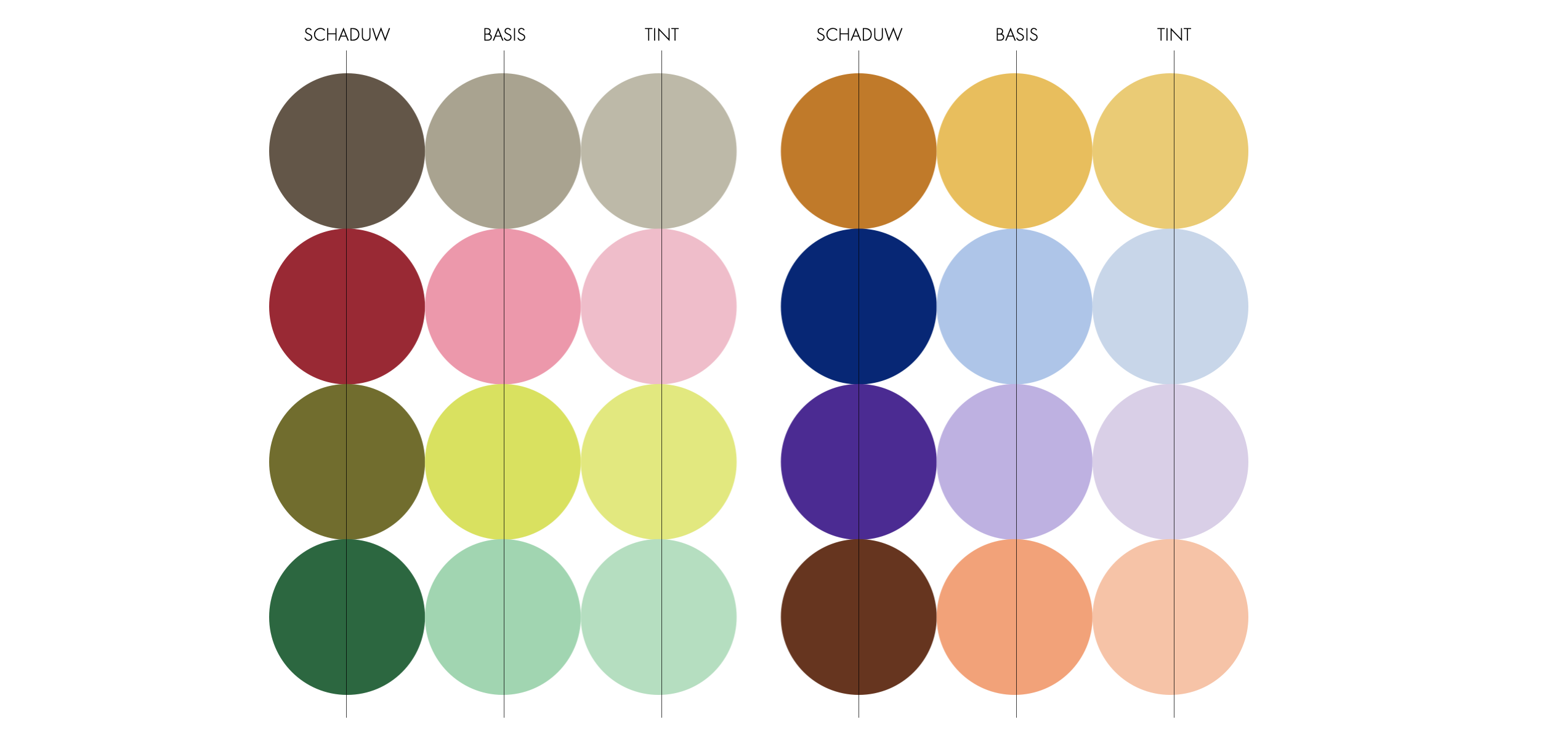
With minimal interventions we achieved maximum succes. By tightening the curves of the ‘lier’ we rejuvenated this classic icon. Curating the existing palet, refreshing for digital and freeing the rules brought much light and liveliness.
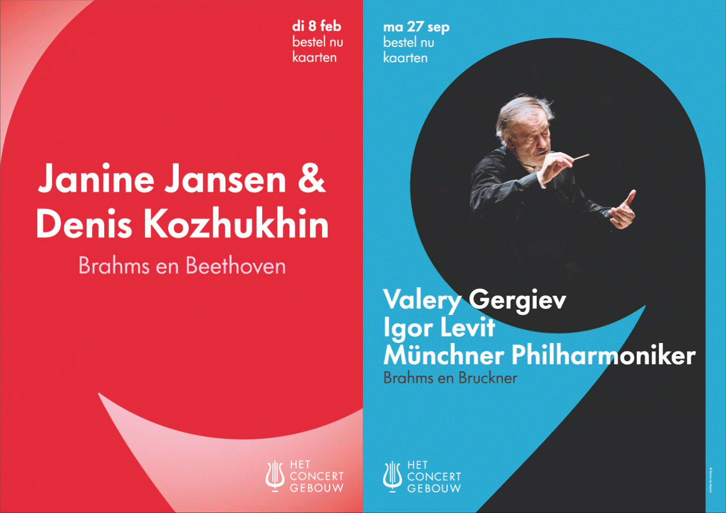
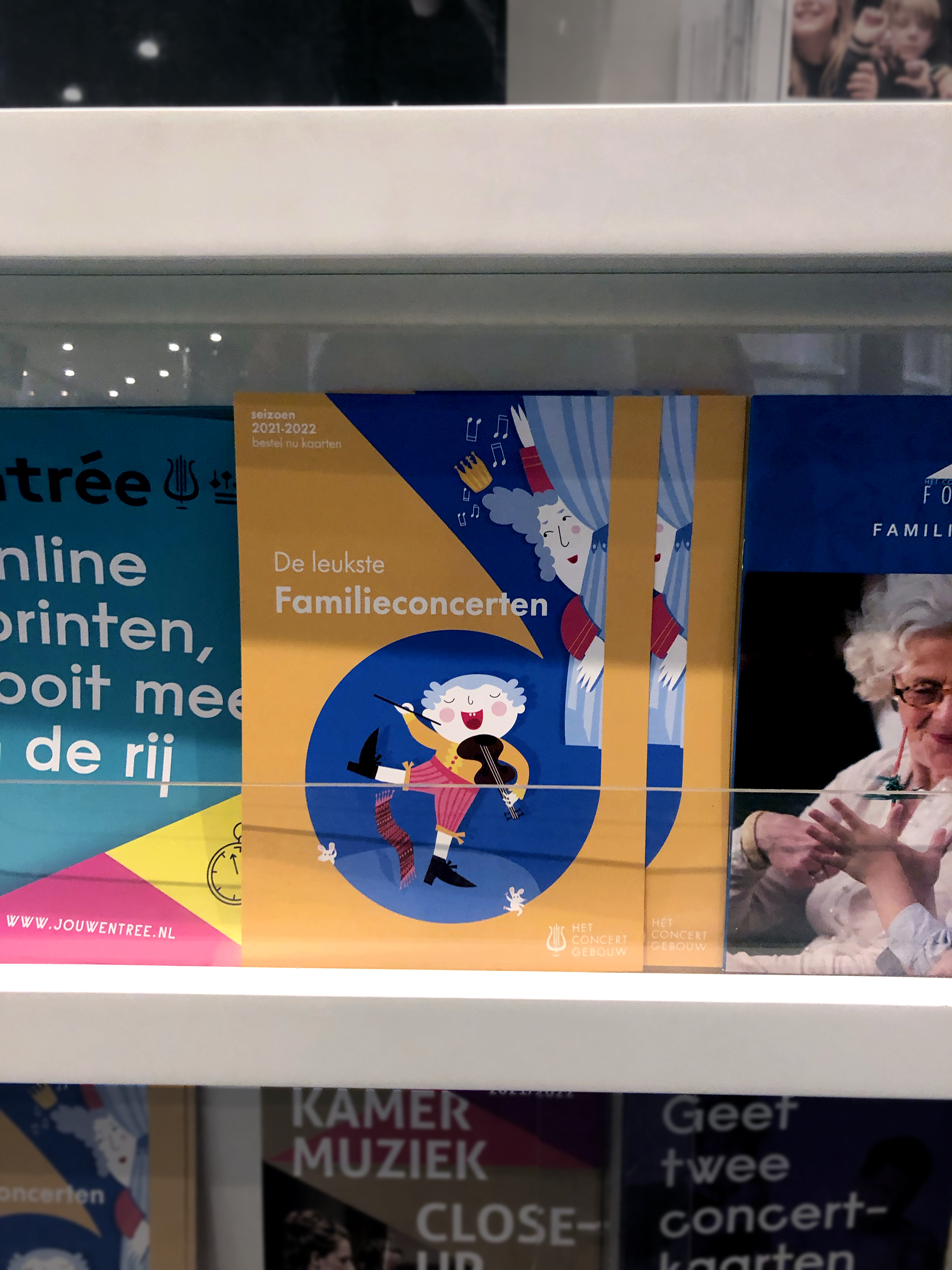
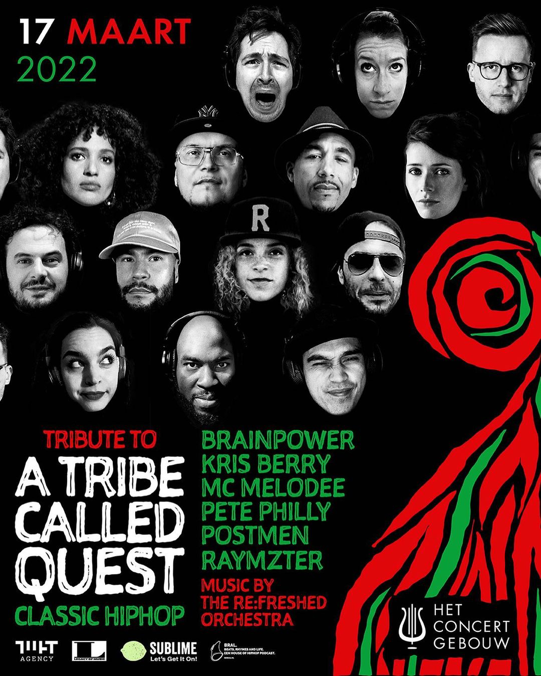
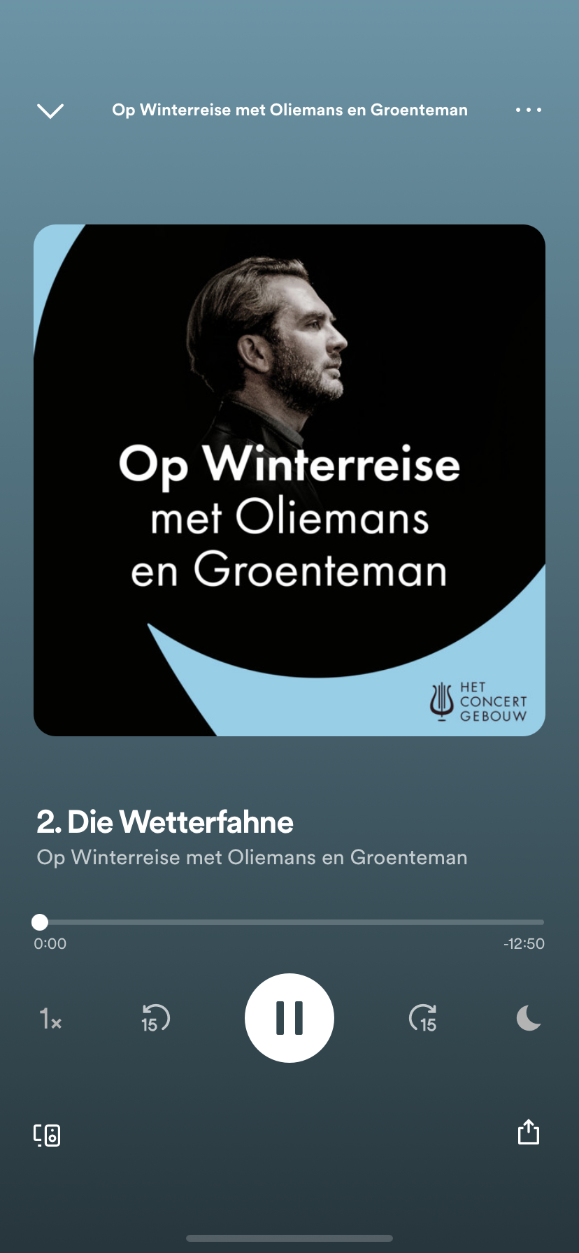
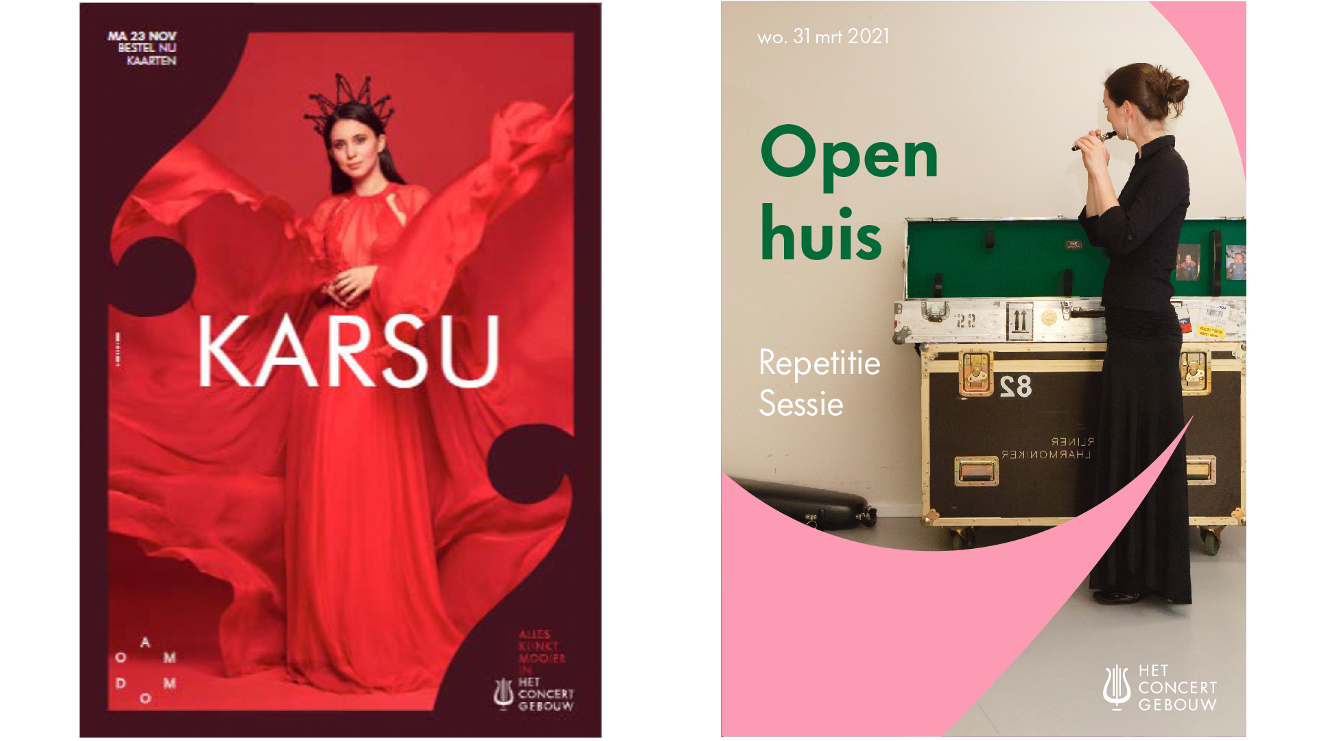
By using the lire in crops we created a set of instantly recognizable frames. Resulting in an identity that feels contemporary, is easy to and appeal to a diverse audience and hold multiple genres besides classical.